Interior decoration with orange tones
At Tarraula, as interior designers with experience in creating unique spaces, we know that colour can completely transform the atmosphere of a home. And if there is a tone capable of filling any room with life, that is orange. The interior decoration with orange tones has made a strong comeback in recent years, and it is no coincidence: we are talking about a warm, vibrant colour, full of aesthetic possibilities.
Why opt for interior decoration in orange tones?
When we design an interior, every colour we choose has a purpose. In the case of orange, that purpose is usually related to the vitalitythe creativity and the optimism. But it's not just an eye-catching colour: when applied well, orange can convey elegance, sophistication and balance.
The symbolism of orange in interior decoration
This colour combines the energy of red with the cheerfulness of yellow, making it an ideal choice for mood-boosting spaces. In particular, the interior decoration with orange tones works very well in:
- Common areas such as lounges or dining rooms.
- Mediterranean-inspired kitchens.
- Creative or work spaces.
- Youth or informal settings.
Variations of the colour orange in interior decoration
One of the advantages of orange is its versatility. We are not limited to deep or neon orange. We can play with a wide range of shades:
- Terracottaideal for warm and natural environments.
- Burnt orangePerfect for a more sober and mature style.
- Coral or peachsoft, elegant and widely used in Nordic decoration.
Mandarin: cheerful and youthful, ideal for small decorative details.
How to combine orange walls in decoration
One of the most common challenges when we use this colour is combining orange walls in decoration without cluttering or clashing with the whole. That's why we're going to show you how to achieve it with balance and style.
Orange walls as a main accent
It is not necessary to paint an entire room. Sometimes a single orange wall can act as a focal point. This technique is effective in living rooms, kitchens or studios, where we want to attract the eye without overloading.
Which colours to combine orange with?
Here are some foolproof combinations:
- Off-white or creambrings clarity and elegance.
- Light grey or taupe: softens the visual impact.
- Olive or sage greenfor natural and sophisticated atmospheres.
- Petrol blue or blue-grey: contrast with personality.
- Natural wood: warm and cosy harmony.
Textiles and accessories that enhance the orange hue
If we prefer not to paint the walls, we can introduce the orange by means of:
- Cushions and blankets.
- Curtains or carpets.
- Squares with orange details.
- Decorative ceramics or vases.
This use of colour creates visual dynamism without the need for renovation.
Interior decoration with orange tones according to decorative style
For the result to be coherent, it is key to adapt the use of orange to the style we want to project. Here we show you how to use it according to different trends.
Vintage style decoration with orange touches
The vintage style decoration goes very well with orange tones, especially those that evoke the 60s and 70s. We can incorporate:
- Mustard orange upholstered armchairs.
- Retro lamps with orange screens.
- Wallpaper with geometric motifs in warm tones.
This approach leads to searches such as "vintage orange decoration". o "70's style with orange tones"..
Mediterranean style with terracotta orange
The combination of terracotta orange with white, wood and ceramics creates very cosy and timeless spaces. Ideal for coastal or rural homes.
Modern or Nordic style with orange accents
Orange in its peach or coral version integrates very well in Nordic environments, especially in contrast with greys and whites. Here, less is more.
Industrial style with rusty orange
If we're going for a more urban style, burnt or rusty orange pairs well with concrete, iron and distressed leather. An industrial living room can have life and strength with this colour well applied.
How to avoid mistakes when decorating with orange tones
Although orange has many virtues, a wrong use can overload the environment or detract from its elegance. That's why we want to help you avoid the most common mistakes.
Do not overuse intensity
Pure orange can be tiring if used in excess. It is advisable to apply it in moderate doses, balanced with neutral or natural tones.
Taking care of the lighting
The interior decoration with orange tones needs good light, preferably natural light. In dark rooms, this colour can become oppressive.
Do not combine with too many bright colours
Avoid mixing orange with reds, bright yellows or intense fuchsias, unless you are looking for a very risky result. Contrast should be controlled.
Choosing consistent materials
Orange looks best on natural textiles, handmade ceramics, matt walls or wood. Avoid excessive shine or plastic materials.
Practical ideas for interior decoration with orange tones
To help you imagine how you could apply all of the above, here are some real examples of elements that you can easily incorporate at home:
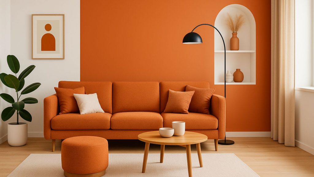
Orange in the living room
- A soft orange or mustard sofa combined with ecru cushions and a light wooden table.
- A rug with ethnic motifs in terracotta and coral tones.
- Floor lamps with orange fabric lampshade.
Orange in the dining room
- Upholstered chairs in burnt orange.
- Orange tableware with orange accents to add warmth to the table.
- Accent wall in peach orange.
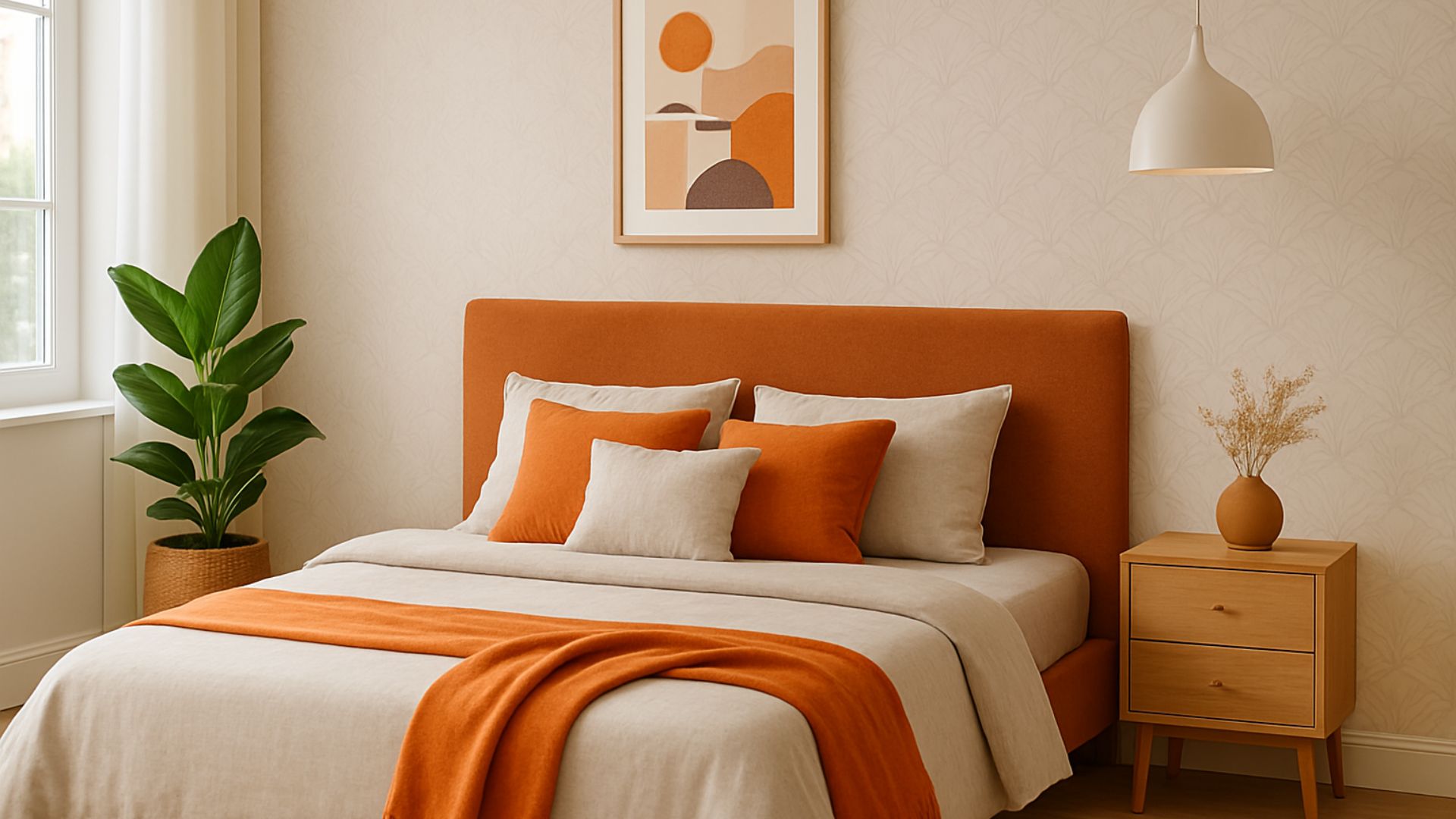
Orange in the bedroom
- Bed linen in earth tones, combined with an orange plaid.
- Paintings with warm or abstract illustrations in warm tones.
- Translucent curtains in light orange.
Orange in the kitchen
- Accessories such as toasters, jugs or tea towels in orange tones.
- Hydraulic tiles with orange motifs.
- Fruits or plants in clay pots decorating worktops.
The transformative power of orange in interior design
As we have seen, the interior decoration with orange tones is much more than a fashion statement. It is a way to bring energy, character and vitality to our spaces. From an accent wall to small decorative details, orange can transform a room.
Because in the end, the most important thing is that your house speaks of you, and that each colour tells a story.
Preguntas frecuentes sobre decoración de interiores con tonos naranjas
¿El color naranja queda bien en la decoración de interiores o cansa demasiado?
Sí, puede quedar muy bien si se utiliza con equilibrio. El problema no suele ser el color en sí, sino la cantidad y la intensidad con la que se aplica. Los tonos más suaves o terrosos, como terracota, coral o naranja quemado, suelen integrarse mejor y resultan más elegantes a largo plazo.
¿Qué colores combinan mejor con el naranja en una casa?
Las combinaciones más agradecidas suelen ser con blanco roto, crema, gris claro, topo, verde oliva, verde salvia, azul petróleo y madera natural. Estos tonos ayudan a suavizar su fuerza visual y hacen que el conjunto se vea más equilibrado y sofisticado.
¿Es buena idea pintar una pared naranja?
Sí, de hecho suele ser una de las formas más acertadas de introducir este color. Una pared de acento permite dar personalidad a la estancia sin saturarla. Funciona especialmente bien en salones, cocinas o zonas de trabajo donde se busca un punto focal con carácter.
¿En qué estancias funciona mejor la decoración con tonos naranjas?
Suele funcionar muy bien en salones, comedores, cocinas y espacios creativos o de trabajo. También puede encajar en dormitorios si se usa en versiones más suaves y a través de textiles o detalles decorativos, en lugar de aplicarlo de forma masiva.
¿Qué tono de naranja es más fácil de integrar en casa?
Los más fáciles de integrar suelen ser el terracota, el naranja quemado, el coral y el melocotón. Son tonos más matizados, menos estridentes y mucho más versátiles para adaptarse a estilos mediterráneos, nórdicos, vintage o incluso industriales.
¿Cómo introducir el naranja sin pintar paredes?
La forma más sencilla es incorporarlo en cojines, mantas, alfombras, cortinas, cuadros, cerámica o pequeños accesorios decorativos. Así puedes aportar calidez y energía al espacio sin hacer cambios permanentes ni recargar el ambiente.
¿Qué errores conviene evitar al decorar con tonos naranjas?
Los errores más habituales son usar un naranja demasiado intenso en exceso, combinarlo con demasiados colores llamativos, aplicarlo en habitaciones con poca luz natural o elegir acabados y materiales que no acompañen. Suele funcionar mejor cuando se equilibra con tonos neutros, texturas naturales y una paleta bien controlada.
What they say about us
Publicado enTrustindex verifica que la fuente original de la reseña sea Google. Cristina, Elisa, and Guillermo embody professionalism. Our family worked with them to furnish our home and we could not be more satisfied. Cristina and her team are experts and highly competent at working with you remotely. From plan development, selection of furniture, textures, and so forth they really came through for us. The installation is flawless and their service level is unmatched. We will certainly be working with them again. We have no hesitation in recommending them and we stress that you are in fantastic and very professional care with Tarraula.Publicado enTrustindex verifica que la fuente original de la reseña sea Google. Behulpzaam en vriendelijk personeel. Prachtige hoekbank gekocht. Opslaan geen probleem ivm oplevering apt in september.Publicado enTrustindex verifica que la fuente original de la reseña sea Google. Un sitio magnífico, gente maravillosa, energía positiva 🏆💪🏼💎Publicado enTrustindex verifica que la fuente original de la reseña sea Google. Met Tarraula hebben we geheel onze nieuwe tweede woonst ingericht. Cristina heeft een zeer goede hedendaagse smaak die de onze perfect matcht, zij heeft leuke ideeën en is comminucatief. De afspraken waren steeds correct alsook de prijs en we verheugen ons met het prachtige resultaat van onze binnenhuisinrichting. Een aanrader!Publicado enTrustindex verifica que la fuente original de la reseña sea Google. We have worked with a Cristina and the Tarraula team for the last 5 years as we needed to furnish a second home remotely through Covid restrictions. Cristina listened to what we liked and didn't like and offered an iteresing range of furniture and accessories using zoom and powerpoint presentantions. Cristina is brillant at judging scale and proportions and finds clever solutions to decorating difficult spaces. She continues to be iterestede in how we are finishing the house and we are realy grateful for all her ideas. Hes instalation team are also first rate and totally trustworthy.Publicado enTrustindex verifica que la fuente original de la reseña sea Google. me recomendaron Tarraula, una inmobiliaria para la decoración de un apartamento que había comprado en Javea. Al principio tienes miedo si te van a acertar los gustos, vas con muchas inseguridades, pero la verdad que fueron muy amables y prudentes a la hora de indicarte, me deje aconsejar por Cristina y no podemos estar mas agradecidos, el apartamento a quedado de revista ESPECTACULAR, tanto interior como exterior la mesa y las sillas de jardín, todo el que entra en el apartamento se queda encantado. Si volviese a realizar otro proyecto no dudaría en volverlos a llamar. Muchas, muchas Gracias a todo el equipo. Esperanza y VicentePublicado enTrustindex verifica que la fuente original de la reseña sea Google. Quedé muy contento con la decoración de mi casa, son muy profesionales, atentos y puntuales en todo. Tienen mucha variedad y te asesoran muy bien. Estuve en varias tiendas de la zona y nada que ver, totalmente recomendable.Publicado enTrustindex verifica que la fuente original de la reseña sea Google. Cristina and her team are a pleasure to work with. From just an initial meeting Cristina understood how we wanted to furnish our new home and came up with lots of ideas that suited our taste perfectly. She is very creative and spotted opportunities that we would never have seen. She has an amazing attention to detail. The furnishings are excellent quality but the team are always open to suggesting alternatives to fit with a given budget.