Matching wall colours with wenge furniture

Matching wall colours with wenge furniture

If you have come this far, you probably have wenge furniture at home (or you are about to buy some) and you are asking yourself the big question: which wall colour will work for you and which will work against you. And we understand perfectly, because wenge is a dark wood with a lot of presence: when well matched, it conveys elegance, depth and a sense of a "well thought out house"; but if we don't balance colour, light and materials well, it can darken the room or make it feel heavy.

In this article we'll take a practical approach: we'll look at palettes, finishes, typical mistakes and combinations that really work.

The first thing we must understand about wenge furniture

Before choosing paint, it is useful to understand what makes wenge special. It is a dark wood (or a finish that imitates it) with pronounced grain and a deep shade between chocolate brown and almost black coffee. This means that:


  • It absorbs more light than a light wood.
  • It provides contrast and "visual weight".
  • It may appear cooler or warmer depending on the rest of the palette.
  • It becomes the protagonist if we surround it with neutral tones.


So when we think of matching wenge furniture wall colourThe key is not only "what colour looks good", but also "what colour looks good". how we balance light + contrast + temperature.

And here comes the first professional criterion: if wenge is the dark "anchor", walls tend to work best when provide clarity, warmth or spaciousnesswithout competing.

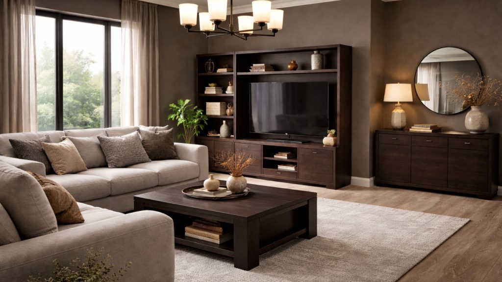
Dark wenge furniture with light walls: why this formula is repeated so often

It is a safe combination. Dark furniture + light walls often give an elegant contrast and help to keep the space from closing in visually.

But beware: "light walls" does not always mean pure white. In fact, optical white often creates too harsh a contrast and makes the wenge look blacker and the space colder. That is why, if we want a sophisticated result, we work with "nuanced" light colours: off-whites, greiges, sands, ivories, soft stone?

We'll look at it in detail, because choosing the "right clearing" makes the difference between the right house and a house that feels like a magazine.

Matching wall colours with wenge furniture

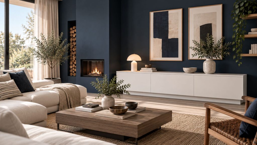
Matching paint with wenge furniture: 7 colour families that work (and when to use them)

Let's get down to what you want: concrete options. Here are some colour families that work very well for combining paint with wenge furniturewith an explanation of "why" and where to apply them.


1) Off-whites and ivories (brightness without hardness)

If the idea of clarity appeals to you, but you don't want a cold contrast, off-whites are the easiest option to get right.

  • They work very well with wenge because they soften the contrast.
  • They provide warmth without yellowing (if we choose the right undertone).
  • They go well with natural textiles: linen, cotton, jute.


Ideal when:

  • We have little natural light.
  • We want the wenge to look elegant, not heavy.


Off-white ivory


2) Greige and sand (the modern neutral)

Greige (a mixture of grey and beige) and sand tones are the most recommended if you want a contemporary and cosy aesthetic.

  • Wenge looks more premium next to warm neutrals.
  • The atmosphere gains continuity and calm.


Ideal when:

  • We are looking for a modern, serene and timeless style.
  • We also want to integrate beige or medium wood flooring.


Greige Arena


3) Warm grey (elegance without darkening)

Grey works, but with nuances. Cool grey can dull the warmth of the space; warm grey, on the other hand, creates a sophisticated base.

  • Very good choice if you like sober interiors.
  • Fits great with black metal, brass or chrome.


Ideal when:

  • There is good natural light.
  • We add warm textiles (earth, cream, soft terracotta) to balance.


Warm Grey


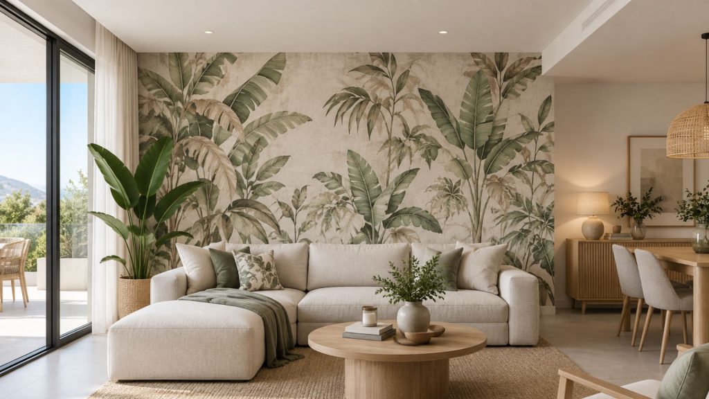
4) Mild sage or olive green (natural and contemporary)

Soft greens are just right: they add colour without saturating, and make the wenge look more organic.

  • Sage green gives a calm and homely feeling.
  • The soft olive adds depth without being as dark as a bottle green.


Ideal when:

  • We want a touch of elegant colour.
  • We are looking for a natural style with plants and fibres.


Bottle sage green


5) Greyish blue (serene and sophisticated)

Muted blues (smoke blue, greyish blue) go well with wenge if we don't go for too intense tones.

  • They bring serenity.
  • They work very well in a rest or study space.


Ideal when:

  • We want a cooler but not cold environment.
  • There is good light entry.


Grey-blue


6) Soft earth: light clay, powdered terracotta (warmth with character)

If you want a really cosy atmosphere, soft earth tones are allies.

  • Wenge, being dark, welcomes an "embracing" wall colour.
  • Very nice with ceramic pieces, light wood and raw textiles.


Ideal when:

  • We are looking for a warm interior with personality.
  • We have warm lighting at night.


soft soil

Earth  Land


7) Deep accent wall (only if we control light and balance)

Here we enter more daring territory: an accent wall in a deep colour (bottle green, petrol blue, warm graphite). It can look spectacular with wenge, but not always.


Ideal when:

  • There is plenty of natural light.
  • The rest of the walls are light.
  • The decoration has an "air" (few pieces, well chosen).


Dark Accent

Combining wenge furniture with white: how to get it right (and avoid looking cold)

The combination "combining wenge furniture with white". is a classic, but this is where most mistakes are made, because "white" can mean a thousand things.


The right white is not always pure white

If the space has low light or cold orientation, pure white can make it:

  • The wenge looks too contrasting (almost black).
  • The ensemble loses warmth.
  • The atmosphere feels "hard".

On the other hand, an off-white or a warm white (soft ivory) achieves:

  • Clean, but friendly contrast.
  • A feeling of spaciousness without coldness.


White + wenge needs texture (if not, it stays flat)

So that the combination does not look "old catalogue", we add texture:

  • Linen curtains or net curtains.
  • Fibre or wool carpets.
  • Weft weave cushions, bouclé, washed cotton.
  • Wall with matt paint or smooth micro texture.

And if we want to top it all off, a third supporting colour works magic:

  • Black (in minor details).
  • Brass or soft gold-plated.
  • Light terracotta.
  • Sage green.

What colour to paint a living room with wenge furniture: criteria that apply to any room

1) We look at the light (quantity and temperature).

  • If there is little light: warm light shades (ivory, sand, light greige) are best.
  • If there is a lot of light: we can afford warm greys or soft greens.
  • If the light is cold (north): avoid optical whites and cold greys.


2) We look at the ground (because it's more important than it looks).

  • Light floor: wenge will provide enough contrast; soft neutral walls.
  • Dark floor: light walls almost obligatory to open up the space.
  • Medium wood flooring: greige, stone or off-white work very well.


3) We decide the "mood": serene, warm or sophisticated.

  • Sereno: greige + raw textiles.
  • Warm: sand + soft soil.
  • Sophisticated: warm grey + black/brass accents.


Quick (interior designer's) rule of thumb not to fail

If you hesitate between two shades, it usually works to choose:

  • The lighter one (if the space is small or with little light).
  • The warmest (if you want home and comfort).
  • The most matt (if you want elegance and premium walls).

Common mistakes when matching paint with wenge furniture (and how to avoid them)

To really get us beyond the typical Google stuff, let's talk about the failures we often see in real projects:


  1. Choosing a white that is too cold
    Result: aggressive contrast and "clinical" feeling.
  2. Paint everything in cool grey because "it's modern".
    Result: the wenge looks heavier and the atmosphere is muted.
  3. Disregarding night lighting
    In warm light, certain greys become greenish or dirty. In cold light, beiges may appear dull.
  4. Do not introduce transitional elements
    If everything is wenge + light wall, "bridging" can be missing: textiles, fibres, art, light wood.
  5. Using gloss on walls

Glitter reflects, marks imperfections and can detract from sophistication. Best matte or washed.

Ready-to-apply palettes (winning combinations with wenge furniture)

Here are some closed proposals that usually work very well with wenge and help you to decide quickly:


  • Palette 1 (bright): off-white + wenge + linen + black in details
  • Palette 2 (modern warm): light greige + wenge + sand + soft brass
  • Palette 3 (natural): soft sage + wenge + ecru + ecru + natural fibres
  • Palette 4 (sophisticated): warm grey + wenge + cream + cream + marble or stone
  • Palette 5 (with character): powdered clay + wenge + ecru + ecru + ceramics


These palettes directly address the intention to matching wenge furniture wall colour and, at the same time, they give you scope to personalise with textiles and decorative pieces.

Wenge can be your best ally (if we accompany it well).

If your goal was to find matching wall colours with wenge furnitureIf you've already got a clear map: light shaded tones, warm neutrals, soft greens, muted blues and powdered earths. We have also seen why the combination dark furniture + light walls works both (that kind of intention "wenge living rooms dark furniture light walls".) and how to get the pairing right "combining wenge furniture with white". without the result becoming cold.


And now comes the important part: if you want the whole thing to look coherent, bright and professionally finished, it's not about choosing "a nice colour", it's about designing a complete atmosphere.


If you would like us to work it out with you, at Tarraula we can help you with an interior design project (complete or in phases) to define the palette, materials, lighting and distribution, and make your wenge furniture look modern, elegant and perfectly integrated.

Preguntas frecuentes sobre cómo combinar muebles wengué

¿Qué es exactamente el color wengué?

El wengué es una madera tropical africana (Millettia laurentii) procedente sobre todo de Congo y Camerún, de tono marrón chocolate muy profundo, casi negro, con vetas oscuras muy marcadas y una densidad alta.

En mobiliario, hoy la mayoría de piezas que se venden como wengué no son madera maciza, sino chapa o melamina que reproduce ese acabado. La diferencia importa a la hora de decidir si una pieza se puede lijar y aclarar o no.

¿Qué diferencia hay entre el wengué y el wengué claro?

No son dos maderas distintas: el wengué claro es una denominación comercial de acabado, no una variedad botánica. Corresponde a un marrón medio con subtono gris, bastante más luminoso que el wengué tradicional y con la veta menos contrastada.

A efectos de combinación, se comporta como una madera media: admite paredes más oscuras y grises cálidos con más margen que el wengué profundo, que casi siempre pide paredes claras para no cerrar el espacio.

¿Los muebles wengué están pasados de moda?

Lo que ha envejecido no es el wengué, sino la combinación con la que se popularizó: wengué junto a blanco brillo, gris frío y acabados lacados, muy propia de los salones de la década de 2000.

El mismo mueble, acompañado de un greige cálido, textiles de lino y algún metal en latón, se lee hoy como una madera oscura sofisticada. Antes de sustituir mobiliario wengué en buen estado, casi siempre compensa cambiar el entorno.

¿Cómo combinar muebles wengué con blanco sin que quede frío?

La clave es descartar el blanco óptico y trabajar con blancos rotos o marfiles de subtono cálido. El blanco puro convierte el wengué en negro por contraste y deja el ambiente con aspecto clínico.

Además, la pareja wengué + blanco necesita textura para no quedarse plana: cortinas de lino, alfombra de lana o fibra, cojines con trama y pintura en acabado mate. Un tercer color de apoyo —terracota clara, verde salvia o latón en detalles— termina de cerrar la combinación.

¿De qué color pintar un dormitorio con muebles wengué?

En dormitorio conviene ser más conservador que en salón, porque el objetivo es el descanso y no el contraste. Funcionan especialmente bien el marfil, el arena y el greige claro, y en dormitorios amplios y con buena luz, un verde salvia muy suave en la pared del cabecero.

Si el dormitorio tiene además el suelo oscuro, las paredes claras dejan de ser una opción y pasan a ser necesarias. Lo desarrollamos en nuestra guía sobre what colour to paint the walls of the bedroom with dark furniture.

¿Qué suelo combina mejor con muebles wengué?

Los que mejor funcionan son los tonos medios y claros con subtono neutro: roble natural, roble claro o porcelánico en gris piedra y greige. Aportan el contraste necesario para que el mueble se lea sin oscurecer la estancia.

Conviene evitar dos extremos: un suelo del mismo tono que el mueble, porque los funde y el mobiliario pierde definición, y un suelo con subtono rojizo (cerezo, sapelly), que choca con el marrón frío del wengué y ensucia el conjunto.

¿Qué colores hay que evitar con muebles wengué?

Los cuatro que más problemas dan son el blanco óptico, el gris frío azulado, los colores saturados y fríos (azul eléctrico, fucsia, turquesa) y cualquier tono oscuro aplicado a todas las paredes de una estancia con poca luz.

Al margen del color, el error más frecuente es el acabado: las pinturas satinadas o brillantes reflejan la luz, marcan las imperfecciones del yeso y restan sofisticación. Con wengué, el mate casi siempre gana.

¿Qué cortinas y textiles combinan con el wengué?

Lo más equilibrado son las cortinas en lino o algodón en tono crudo, arena o marfil, siempre acompañando al color de la pared y no al del mueble. Una cortina blanco óptico repite el error del blanco puro en pared y endurece el contraste.

En alfombras funcionan muy bien las fibras naturales y la lana en tonos crudos: aportan la capa de transición que suele faltar entre un mueble oscuro y una pared clara. Ese "puente" textil es lo que evita que la combinación se vea seca.

¿Se puede aclarar o pintar un mueble wengué?

Depende del material. Si es madera maciza, se puede lijar, decapar y aplicar un tinte o un esmalte más claro. Si es chapa o melamina, que es lo habitual, lijar no es viable: la chapa apenas tiene unas décimas de milímetro y la melamina no admite lijado.

En esos casos la única vía es pintar, con desengrasado previo, imprimación de adherencia específica para melamina y esmalte al agua en dos manos finas. Sin imprimación, la pintura acaba saltando en cantos y zonas de roce en pocos meses.

What they say about us

Publicado en Google Google
Bert Jan Vukkink profile picture
Bert Jan Vukkink
Google star 1Google star 2Google star 3Google star 4Google star 5Trustindex verifica que la fuente original de la reseña sea Google.
We gave our interior design project to the ladies of Tarraula with great pleasure. Their ideas and design ideas went much further than what you see in their store. Our final interior design was perfect and very different in style on what you see at their place. There are no limitations. Anything, from anywhere in the world can be ordered through them. We would thank the Tarraula team for their dedication, advices, quality and great after sales support! It was really a great pleasure working with Tarraula. We can highly recommend them!
Publicado en Google Google
Marc Honegger profile picture
Marc Honegger
Google star 1Google star 2Google star 3Google star 4Google star 5Trustindex verifica que la fuente original de la reseña sea Google.
An absolute pleasure to work with – highly recommended! ⭐⭐⭐⭐⭐ A bit more than a year ago, we bought a house in Spain dating back to 1998 and decided to completely renovate it. We were looking for an interior designer who could understand our ideas, develop a concept for the renovation and interior, and also coordinate the entire project, including the selection and purchase of furniture. After two disappointing experiences with other interior designers, a colleague recommended Cristina from Tarraula in Jávea. And what a lucky recommendation that turned out to be! From our very first meeting, we immediately felt that Cristina understood us and what we were looking for. She listened carefully to our ideas, made fantastic suggestions and had a wonderful sense of how to create the atmosphere and style we had in mind. We loved her ideas for both the renovation and the furniture, and very quickly felt confident enough to entrust her with the entire project. Four months later, we returned to Spain and were absolutely blown away. Wow – what a transformation! Our house had been completely renovated and turned into a beautiful, warm and stylish Spanish home. The furniture was carefully selected, the workmanship was excellent, and every detail came together perfectly. Cristina and her colleague did a fantastic job coordinating and supervising the entire renovation. The craftsmen were excellent, everything was handled professionally, and the quality of the work was truly outstanding. But what matters most to us is how we feel about the result: we absolutely love our home! It now has exactly the style and atmosphere we had hoped for – and honestly, we cannot imagine having done it any better. Looking back, we can say with complete confidence that the investment was absolutely worth it. We are incredibly happy that we found Cristina and would wholeheartedly recommend her and the entire Tarraula team to anyone looking for creativity, professionalism, quality and someone who genuinely cares about creating a home that reflects the people who live in it. Thank you so much, Cristina, for turning our house into the home we dreamed of! ❤️
Publicado en Google Google
Olha Barkhausen profile picture
Olha Barkhausen
Google star 1Google star 2Google star 3Google star 4Google star 5Trustindex verifica que la fuente original de la reseña sea Google.
Tarraula is highly recommended design company. They decorated our entire villa, from the wallpaper, which gave each room a unique look, to the curtains, pillows, and bedding. Tarraula collaborates with many factories and suppliers, so you can choose any style, any color for your home, any piece of furniture or decor. Combined with excellent service and a professional team. The company also provides follow-up services if needed. We've been working with Tarraula for five years, and it's been a successful collaboration.
Publicado en Google Google
merel de ruiter profile picture
merel de ruiter
Google star 1Google star 2Google star 3Google star 4Google star 5Trustindex verifica que la fuente original de la reseña sea Google.
Dear Christina, After two years of renovations, we can finally fully enjoy our home in Jávea! And it has turned out absolutely beautiful! Thanks to all your hard work, ideas, and dedication, it has become exactly what we had envisioned. Thank you so much for all your help and for such a lovely and enjoyable collaboration! You have truly helped make this house feel like our second home. With love, Marieke & Henk
Publicado en Google Google
Patrick Molinari profile picture
Patrick Molinari
Google star 1Google star 2Google star 3Google star 4Google star 5Trustindex verifica que la fuente original de la reseña sea Google.
Cristina, Elisa, and Guillermo embody professionalism. Our family worked with them to furnish our home and we could not be more satisfied. Cristina and her team are experts and highly competent at working with you remotely. From plan development, selection of furniture, textures, and so forth they really came through for us. The installation is flawless and their service level is unmatched. We will certainly be working with them again. We have no hesitation in recommending them and we stress that you are in fantastic and very professional care with Tarraula.
Publicado en Google Google
jos profile picture
jos
Google star 1Google star 2Google star 3Google star 4Google star 5Trustindex verifica que la fuente original de la reseña sea Google.
Behulpzaam en vriendelijk personeel. Prachtige hoekbank gekocht. Opslaan geen probleem ivm oplevering apt in september.
Publicado en Google Google
Teodor Nikolov profile picture
Teodor Nikolov
Google star 1Google star 2Google star 3Google star 4Google star 5Trustindex verifica que la fuente original de la reseña sea Google.
Un sitio magnífico, gente maravillosa, energía positiva 🏆💪🏼💎
Publicado en Google Google
Eric De Coster profile picture
Eric De Coster
Google star 1Google star 2Google star 3Google star 4Google star 5Trustindex verifica que la fuente original de la reseña sea Google.
Met Tarraula hebben we geheel onze nieuwe tweede woonst ingericht. Cristina heeft een zeer goede hedendaagse smaak die de onze perfect matcht, zij heeft leuke ideeën en is comminucatief. De afspraken waren steeds correct alsook de prijs en we verheugen ons met het prachtige resultaat van onze binnenhuisinrichting. Een aanrader!
Publicado en Google Google
deborah Coen profile picture
deborah Coen
Google star 1Google star 2Google star 3Google star 4Google star 5Trustindex verifica que la fuente original de la reseña sea Google.
We have worked with a Cristina and the Tarraula team for the last 5 years as we needed to furnish a second home remotely through Covid restrictions. Cristina listened to what we liked and didn't like and offered an iteresing range of furniture and accessories using zoom and powerpoint presentantions. Cristina is brillant at judging scale and proportions and finds clever solutions to decorating difficult spaces. She continues to be iterestede in how we are finishing the house and we are realy grateful for all her ideas. Hes instalation team are also first rate and totally trustworthy.

More than 50 years of experience.

We design your space

At Tarraula, we have a team of professionals who will advise you and manage your home or contract your housing or contracting project down to the smallest detail, regardless of its size, as for us there is no such thing as a small project. for us there is no such thing as a small project.